Psychology of Web Design
A website is more than just an online presence—it’s an experience. Every element on a page, from the colour scheme to the typography, influences how users feel, think, and act. This isn’t just about aesthetics; it’s about psychology. A well-designed website guides visitors seamlessly toward the actions you want them to take, whether that’s making a purchase, signing up for a newsletter, or simply engaging with your brand.
At Cheap Web Design UK, we understand that effective web design is rooted in the way people perceive and interact with a site. Let’s explore how colours and fonts shape user behaviour and how you can use them to your advantage.
The Power of Colour Psychology in Web Design
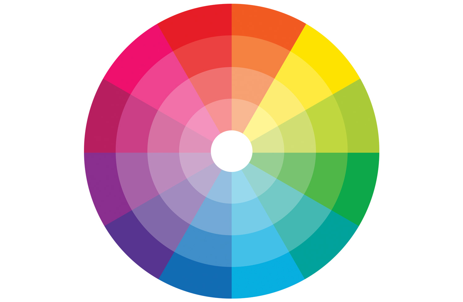
Colours aren’t just decoration; they evoke emotions and influence decisions. Studies show that people make subconscious judgments about a product within 90 seconds of viewing it, and a significant portion of that judgment is based on colour alone.
Red is bold and attention-grabbing. It creates a sense of urgency, which is why it’s often used for clearance sales or call-to-action buttons. However, too much red can feel overwhelming, so it’s best used sparingly.
Blue represents trust and professionalism. Banks, healthcare providers, and tech companies frequently use blue to create a sense of reliability. Facebook, LinkedIn, and PayPal all use blue because it conveys a sense of security and dependability.
Green is associated with growth, health, and relaxation. It’s commonly used in eco-friendly brands and financial sectors because it symbolizes stability and wealth. Green also has a calming effect, making it ideal for websites that promote wellness or sustainability.
Yellow is bright and energetic, often used to capture attention and create warmth. However, excessive yellow can feel overwhelming, so it’s best paired with neutral tones.
Black is sleek, modern, and sophisticated. Luxury brands often use black to convey exclusivity and high value. However, an all-black design can feel cold if not balanced with other colours.
White represents cleanliness and simplicity. It’s often used in minimalistic designs to enhance readability and create a spacious, uncluttered look.
The key to using colour effectively is balance. Choosing the right combination can enhance usability, drive conversions, and build brand recognition. For example, using a blue and white colour scheme with red call-to-action buttons creates a trustworthy yet action-driven experience for users.

Choosing the Right Fonts for Your Website
Fonts do more than make text readable; they shape the user experience and define a brand’s personality. Just like colours, fonts trigger emotions and influence how users perceive a website.
Serif fonts, like Times New Roman or Georgia, are traditional and authoritative. These fonts work well for formal or academic websites, giving a sense of credibility and trustworthiness. Newspapers and law firms frequently use serif fonts because they feel classic and professional.
Sans-serif fonts, such as Arial or Helvetica, are modern and clean. These fonts are widely used in tech and startup businesses because they feel approachable and easy to read on screens. Google, Apple, and Facebook all use sans-serif fonts to create a sleek and simple look.
Script fonts resemble handwriting and are often used for branding that needs a personal touch. However, they should be used sparingly because they can be difficult to read in large blocks of text.
Display fonts are unique and decorative, often used for logos or headlines. They add personality to a website but should be used carefully to avoid clutter.
The best practice for font selection is to use no more than two to three fonts on a website. A clean sans-serif for body text and a bold serif or display font for headlines creates a balanced and visually appealing design.

How Colours and Fonts Influence User Behaviour
Your choice of colours and fonts directly impacts how users engage with your site. If your website is cluttered with multiple fonts and conflicting colours, visitors will struggle to process the information, leading to higher bounce rates.
For example, a well-designed call-to-action button uses contrasting colours to grab attention. A red or orange button on a blue background naturally draws the eye and encourages clicks. Pairing it with a bold, easy-to-read font ensures that users know exactly what action they’re supposed to take.
Readability also plays a massive role in user retention. If your website uses thin, hard-to-read fonts, users will quickly leave. Large, clear typography with adequate spacing enhances the reading experience and keeps visitors engaged.
Mobile responsiveness is another factor to consider. Fonts should be legible on all screen sizes, and colour contrast should be optimized for visibility on both desktop and mobile devices.
Real-World Examples of Effective Colour and Font Usage
Successful brands leverage colour psychology and typography to create highly engaging user experiences. Take Coca-Cola, for example. Their iconic red branding isn’t just for aesthetics—it creates excitement and urgency, making their products feel dynamic and energetic.
On the other hand, Apple uses a minimalist black, white, and grey palette with simple sans-serif fonts. This creates a sense of sophistication, reinforcing their brand as sleek, modern, and high-end.
Even fast-food chains like McDonald’s strategically use red and yellow to stimulate appetite and create a sense of speed, encouraging quick decision-making.
How to Apply Colour and Typography Psychology to Your Website
If you want your website to be more engaging and conversion-driven, consider these strategies:
- Define Your Brand’s Personality – Are you a fun, playful brand or a professional, trustworthy business? Your colour scheme and font choices should align with your brand identity.
- Use High-Contrast Colours for Readability – Avoid using similar shades for text and backgrounds. A dark font on a light background (or vice versa) ensures better legibility.
- Guide Users with Strategic Colour Placement – Use accent colours to highlight key areas, such as CTAs and navigation buttons.
- Ensure Font Consistency – Stick to a maximum of two to three fonts across your website to maintain a clean and cohesive look.
- Test and Iterate – A/B test different colours and font styles to see what works best for your audience. Small design tweaks can lead to significant improvements in engagement and conversions.
Elevate Your Web Design with Cheap Web Design UK
Your website’s design is the first impression visitors have of your business. Using the right colours and fonts isn’t just about making things look good—it’s about creating a seamless, user-friendly experience that builds trust and drives action.
At Cheap Web Design UK, we specialize in affordable, high-quality web design that blends psychology with functionality. Whether you need a fresh new website or want to refine your current design, our team is here to help.
Visit Cheap Web Design UK today to explore our web design services or get in touch for a consultation. Let’s build a website that speaks to your audience and delivers real results.


