The Ultimate Guide to Responsive Web Design: Why It Matters and How to Get It Right
Learn why responsive web design is a must and how to get it spot on. Find out how to make your website look awesome on any device and why it’s important for SEO. Need a hand?
Check out Cheap Web Design UK for professional website design and development services.
Introduction into Responsive Web Design
Picture this: You’re trying to check out a website on your phone, but the text’s tiny, the images are all over the shop, and you’re pinching’ and zooming’ just to read the content on the page. Annoyin’, isn’t it? That’s exactly what happens when a site ain’t designed to be responsive. Most people are glued to their mobiles, having a website that works on any screen is a must no ifs, no buts.
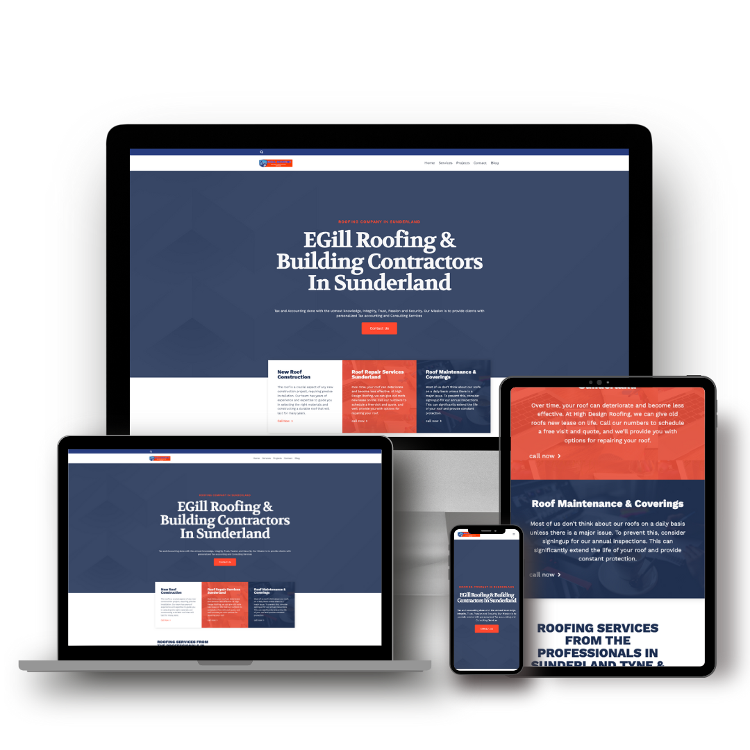
Responsive web design (RWD) makes sure your site looks class no matter what device someone’s usin’. Whether they’re scrollin’ on their phone, flipping through on a tablet, or sitting at a big desktop screen, your website needs to adjust automatically without making’ it a nightmare to use.
In this guide, I’ll take you through the nitty-gritty of responsive web design what it is, why it’s so important, and how you can make your website proper user-friendly. If you’re a business owner, a web developer, or just someone who wants their site to look spot on, you’ll find everything you need right here.
What is Responsive Web Design?
Responsive web design (RWD) is all about making sure your website works smoothly across different screen sizes. Instead of faffing about with separate versions for desktop and mobile, Responsive Web Design lets one site adapt itself to whatever device it’s being viewed on.
With fluid grids, flexible images, and CSS media queries. These clever tricks make sure your layout, text, and images shift about properly, so the user gets a seamless experience, no matter what device they are using.
A BETTER EXPERIENCE FOR YOUR VISITORS
Let’s be honest, if your website’s naff to use, people aren’t gonna stick around. A site that looks canny on any device means visitors can find what they need quickly, with no messin’ about. That keeps them happy, engaged, and more likely to convert into customers.
A responsive website makes sure text is readable, buttons are easy to tap, and pages load fast, which means folk are less likely to get fed up and click away.
GOOGLE LOVES RESPONSIVE WEBSITES
If you’re botherin’ about where your site ranks on Google, then listen up, Google prioritises mobile-friendly websites in search results. Since they brought in mobile-first indexing, your site’s mobile version is the main one Google looks at. If your site ain’t responsive, you’ll struggle to climb the rankings.
If you want to check whether your site’s mobile-friendly, you can use Google’s Mobile-Friendly Test. If the results aren’t great, it’s time to get crackin’ on a responsive redesign.
SAVES TIME AND MONEY
Back in the day, businesses had separate websites for mobile and desktop, absolute nightmare. Twice the work, twice the cost, and twice the hassle to keep everything updated. With responsive design, you’ve got one website that does it all, saving you time and cash while making life easier.
MORE SALES AND CONVERSIONS
Ever tried to buy something on your phone but given up cos the checkout page was a mess? That’s what happens when sites ain’t responsive. If people can’t navigate smoothly or click the right buttons, they’ll ditch your site and spend their money elsewhere. A slick, responsive site means fewer headaches and more happy customers.

How to Implement Responsive Web Design
1. Use Fluid Grid Layout.
Forget fixed widths, responsive sites use fluid grids that adjust based on screen size. Instead of settin’ widths in pixels, use percentages so your layout scales properly. This keeps everything neat and tidy, no matter what device your users are using.
2. How to Make Flexible Images
Images can be a right pain on smaller screens if they don’t scale properly. Use CSS to make sure images don’t get bigger than they should be. Something like this will do the trick:
img {
  max-width: 100%;
  height: auto;
}
That way, your images stay looking crisp without wrecking your layout.
Add Media Queries to your CSS
Media queries let your site apply different styles based on the screen size. Here’s a quick example:
@media (max-width: 768px) {
  body {
    font-size: 16px;
  }
}
This makes sure your text stays readable on smaller screens without looking daft.
Optimise Navigation for Mobile Users
On a big screen, a horizontal menu works fine. On a phone? Not so much. That’s where a “hamburger menu” comes in handy. This keeps things tidy and lets users tap to open the menu when they need it, instead of clutterin’ up the screen.
Test Your Site Across Different Devices
It’s no good just checking your site on your laptop, test it on phones, tablets, and different browsers too. Use tools like Google’s Mobile-Friendly Test and Chrome DevTools to make sure everything’s working as it should.
Common Challenges & How to Fix them
1. SLOW LOADING TIMES
Big images and bloated code slow down your site, especially on mobile. Compress images, enable caching, and use a Content Delivery Network (CDN) to keep things speedy.
2. BROWSER QUIRKS
Different browsers handle things differently, so test your site on Chrome, Safari, Firefox, and Edge to avoid any weird issues.
3. COMPLEX IMPLEMENTATION
Responsive design takes a bit of graft, but it’s worth it. If you need a hand, get in touch with the team at Cheap Web Design UK. They’ll get your site sorted in no time.
Responsive Web Design Questions (FAQs)
Responsive design adjusts fluidly to any screen size, while adaptive design uses fixed layouts for different screen types.
Aye, but it depends on your current setup. You’ll need to tweak your CSS, images, and layout to get it right.
Not if it’s optimised properly. Use image compression, caching, and minified code to keep it snappy.
CONCLUSION
Responsive web design ain’t just a fancy add-on, it’s essential. If your site doesn’t adapt to different screens, you’re losing visitors, sales, and SEO rankings.
Want a website that looks class on every device? Check out Cheap Web Design UK for, affordable web design and development services. Get in touch today and let’s make your website work the way it should!


